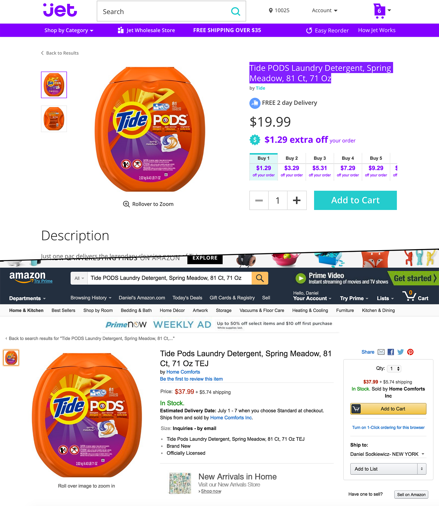
Jet.com has a very different approach to e-commerce, including the way they design their product pages. For example, you may notice that in comparison to their competition, JET keeps their product pages very clean, with only necessary data. Below is interesting insight into how JET is designed, and how the product page is not just random information from a JET designer, but it is very much data driven.
It seems, the secret to JET’s incredible conversion rates is based on UserTesting, which is a user experience research platform. This has allowed JET to gain valuable insights from the testers, which is a glimpse into the buying habits of their customers. JET was able to learn that customers often look for more information on the product detail pages, which includes: shipping, how to reach customer service, and the return policy. JET then chose to put all of this information in the center of the product detail page, which “improve conversion rates significantly,” according to JET Director of research, Ben Babcock. This improvement of sales conversion was achieved due to the user testing of features on JET.
JET uses the data from usability testing to make their company successful. It was not just randomly put there by a designer, and that is why JET is growing quickly in the e-commerce marketplace.
Product page design, JET vs. Amazon
