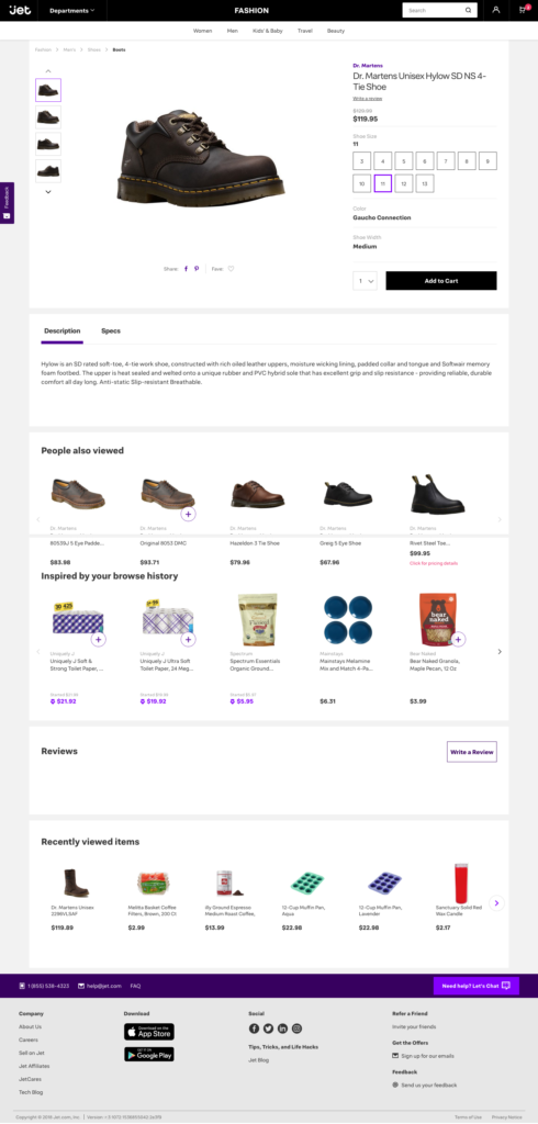
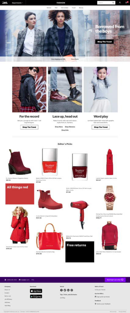
Jet.com just got a new look and it looks great! Let’s see what changed.
The redesign revealed a new direction for Jet, targeting a specific audience, delivering great service to selected demographics, rather than trying to be another Walmart.
Beginning in October, Nike and Converse merchandise will be available on Jet. With hundreds of products shoppers will be able to get those brands’ apparel, sneakers and other workout accessories. Jet is still an authorized Apple reseller.
Jet customers in New York will now have new grocery shopping options with 3-hour delivery (this is possible thanks to Parcel, a logistics company Walmart acquired last year)! New Yorkers are also able to order local and craft beer eligible for same-day delivery.
Those changes unfortunately mean also that many 3rd party sellers were taken out from the marketplace, while Jet established direct partnerships with larger brands. However, there are still many 3rd party sellers listing their products on Jet, and thanks to the redesign their products have more chance to be purchase.
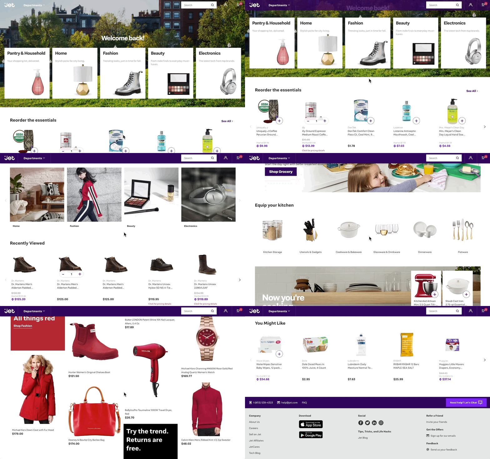
The new homepage clearly shows the main categories that Jet is focused on: Pantry and Household, Home, Fashion, Beauty and Electronics.
The homepage got also very personalized, if you are logged in user you will see your previous purchases, your recently viewed products and suggested to you items. There is also an editorial picks section. It all looks very well crafted and, at least for me, very much correctly guessing my personal style and needs.
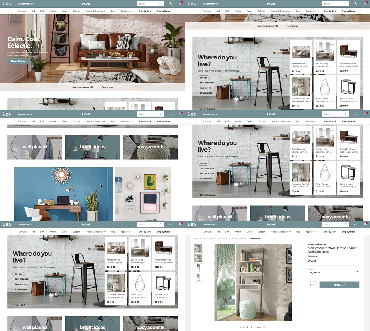
The header got a big redesign, you can now clearly see in which section of the store you are, and the search box has been moved to the right, nicely expanding only when you need it. You can also see there well thought through subcategories. For example for Home products you can pick to shop by Room or Style
One big thing, which I remember was an issue back 2 years ago, is amount of reviews. You cannot complain now about their lack. Over the months, Jet collected many reviews from their buyers, on top of that also getting an access to all the Walmart reviews, this gives an access to pretty robust amount of reviews allowing the ranking to be useful.
Product pages also got a nice redesign, the photos are now bigger, and the drop down with options much nicer. Options like colors or size have also a nice visual elements, like boxes and thumbnails. Previously, a simple drop down was dominating.
Jet also took effort to work with sellers to get their data well organized, thanks to assigned to product attributes, category pages have more useful option you can filter our product by.
This is a great step forward for Jet.com!
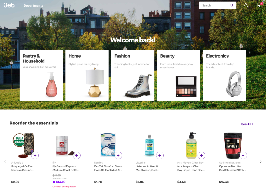
Homepage 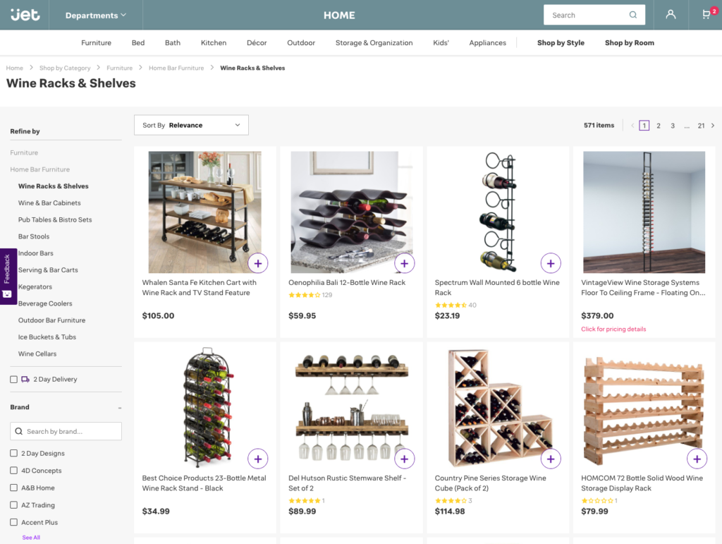
Subcategory page 